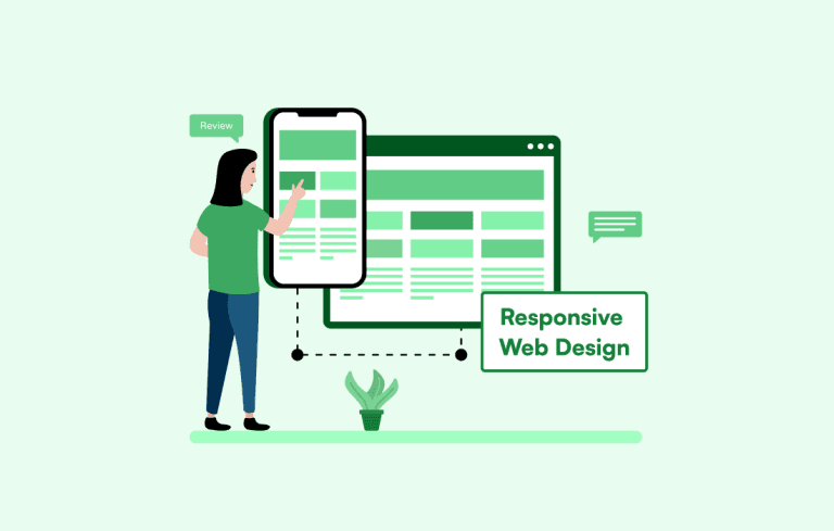
Responsive Web Design: What It Is, Why It Matters, and How to Get It Right in [2026]
Responsive web design helps your website adapt to any screen size, from phones to desktops. This guide covers its core principles, key components, modern CSS techniques, real examples, and practical tips for building responsive sites in 2026.
Summarise with AI
Here is a question for you.
When was the last time you opened a website on your phone and had to pinch, zoom, and scroll sideways just to read a single paragraph?
Frustrating, right?
That frustration is exactly what responsive web design solves.
We live in a world where people jump between phones, tablets, and laptops dozens of times a day. Your website needs to keep up. If it does not, visitors leave. Google pushes your page lower. And your competitors take the traffic you could have had.
In this guide, we are going to break down what responsive web design actually means, why it matters more in 2026 than ever before, and how you can build a website that looks and works great on every single screen.
Let’s get into it.
TLDR
Responsive web design ensures your website adapts seamlessly across all devices, improving user experience, SEO, and conversions in a mobile-first world. It’s essential in 2026 due to rising mobile traffic, Google’s indexing approach, and user expectations for fast, smooth interfaces. This blog discusses what responsive design is, why it matters, its core principles, key components, best practices, tools, and real-world examples.
Table of Contents
What Is Responsive Web Design?
Responsive web design is a web development approach that ensures a website automatically adapts its layout, images, and content to different screen sizes and devices, including smartphones, tablets, and desktops.
Instead of building separate versions for mobile and desktop, developers create a single flexible website that adjusts dynamically based on the user’s screen. This improves usability, consistency, and performance across devices.
The concept was introduced by Ethan Marcotte in 2010 and is built on three core principles: fluid grids, flexible images, and CSS media queries. These fundamentals remain essential, even as modern techniques like CSS Grid, Flexbox, and container queries have evolved.
In simple terms, responsive design allows a website to adapt to different screen sizes and reorganize itself to deliver an optimal viewing experience on any screen.
Why Responsive Web Design Matters in 2026
Responsive design has been optional for years. In 2026, it is the baseline standard for any serious website and a core part of modern web development services. Here is why.
1. Mobile Traffic Dominates the Internet
Mobile devices now generate over 60% of all web traffic globally. In Q2 2025, that number hit 62.54%. If your site does not work well on a phone, you are ignoring the majority of your visitors.
2. Google Uses Mobile-First Indexing
Google crawls and indexes the mobile version of your website first. If your mobile experience is poor, your rankings suffer across all devices. Not just on phones, but on desktop search results too.
3. Users Judge Your Brand by Your Website
It takes about 50 milliseconds for someone to form an opinion about your website. That is 0.05 seconds. Research shows that 94% of negative feedback about websites is related to design. If your site looks broken on a tablet or loads slowly on a phone, people associate that experience with your brand.
4. The Market Is Growing Fast
The global web design market was valued at $49.93 billion in 2024 and is projected to grow to $124.64 billion by 2033. Responsive design is one of the primary drivers behind this growth. Companies across industries are investing in websites that work on every device.
5. It Directly Impacts Conversions
Studies show that mobile users convert at 64% higher rates than desktop users when the experience is smooth. But 61% of users say they will not return to a website that gave them a poor mobile experience. And 40% will go straight to a competitor instead. That is not just traffic lost. That is revenue walking out the door.
Responsive Web Design vs. Adaptive Design: What Is the Difference?
These two terms get mixed up a lot. They both deal with making websites work across devices, but they take very different approaches.
Responsive design uses fluid grids that continuously adjust as the browser width changes. Everything resizes smoothly in real time. You build one layout, and it flexes to fit any screen.
Adaptive design uses multiple fixed layouts. The server detects the device and serves a pre-built layout for that specific screen width (like 320px, 768px, or 1024px). It snaps between these fixed sizes rather than flowing smoothly.
| Aspect | Responsive Design | Adaptive Design |
| Layout Behavior | Fluid grids resize dynamically | Fixed layouts for specific screen widths |
| Design Approach | Mobile-first, content-first | Device-specific, multiple templates |
| Development Effort | Single layout with CSS media queries | Multiple versions to design, test, maintain |
| Scalability | Handles new devices automatically | Needs new layouts for new screen sizes |
| Cost | More cost-effective long term | Higher cost due to multiple layouts |
| SEO | Google recommends responsive design | Less flexible, may need separate optimization |
| Best For | Modern websites, universal accessibility | Legacy systems, specific device targeting |
For most projects in 2026, responsive design is the clear winner. The device landscape is too fragmented to predict every possible screen size, and responsive design handles that uncertainty naturally.
Core Principles of Responsive Web Design
Before we get into the technical components, let’s cover the foundational principles that guide every responsive design decision and form a critical part of the modern web development process.
1. Mobile-First Design
Start with the smallest screen and build upward. This forces you to prioritize what actually matters. Your most important content, your primary call to action, your core message. These should all work perfectly on a phone before you start adding desktop flourishes.
Mobile-first is not just a design preference. It aligns with how Google indexes your site and how most users access the web today.
2. Flexible Grids and Layouts
Instead of using fixed pixel widths, responsive layouts use relative units like percentages, em, rem, and viewport units (vw, vh). This means your columns, containers, and spacing scale proportionally with the screen.
CSS Grid and Flexbox are the two primary layout systems for modern responsive design. Grid handles two-dimensional layouts (rows and columns), while Flexbox works best for one-dimensional arrangements. Most responsive websites use both together.
3. Responsive Images and Media
Images need to be resized without breaking the layout or slowing down the page. The basic approach is to set max-width: 100% so images never overflow their container. But modern responsive design goes further with the srcset attribute, which serves different image sizes based on the device’s screen resolution and capabilities.
Using WebP format for photos and SVG for icons and logos helps reduce file size while maintaining visual quality across all devices.
4. Media Queries
Media queries are CSS rules that apply different styles based on device characteristics like screen width, height, or orientation. They are the mechanism that makes responsive design work.
In 2026, the trend has shifted from fixed breakpoints (like 768px for tablets, 1024px for laptops) to content-based breakpoints. Instead of designing for specific devices, you set breakpoints where your content naturally needs adjustment. This approach is more future-proof because it adapts to any screen, not just the popular ones today.
Key Components That Make Responsive Web Design Work
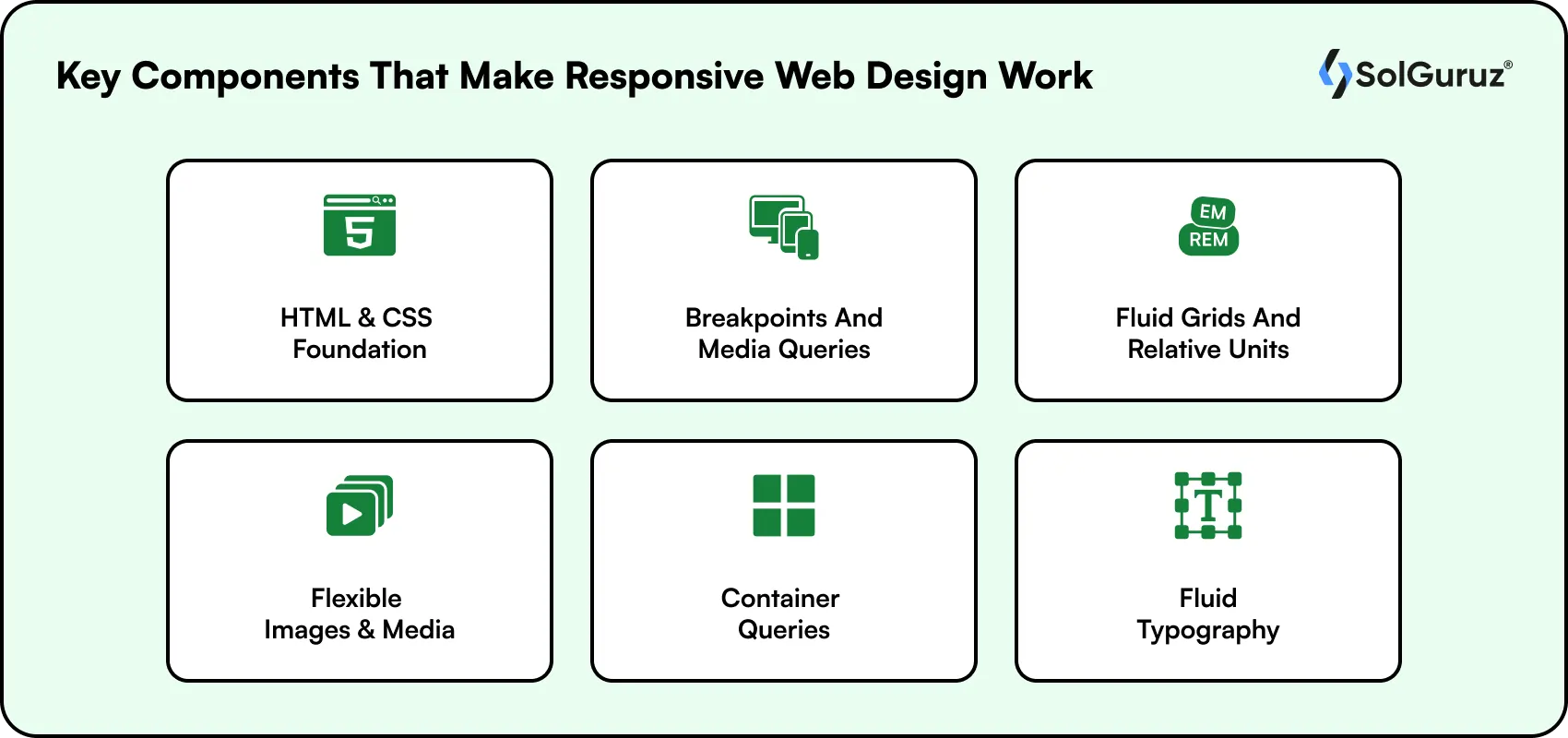
Now let’s look at the specific technical elements you need to get right.
1. HTML and CSS Foundation
HTML provides the structure (headings, paragraphs, images, buttons), and CSS controls how everything looks and behaves. For responsive design, your CSS needs to include flexible layouts, relative sizing, and media queries.
The viewport meta tag is also important. Adding <meta name=’viewport’ content=’width=device-width, initial-scale=1′> tells the browser to match the page width to the device width and set the initial zoom level. Without this tag, mobile browsers often render pages at a desktop width and then scale them down.
2. Breakpoints and Media Queries
Breakpoints are the screen widths where your layout changes. Common breakpoints in 2026 include 480px (phones), 768px (tablets), 1024px (laptops), and 1280px (desktops). But smart developers set breakpoints based on where the content breaks, not based on device categories.
For example, if your navigation menu starts looking cramped at 850px, that is your breakpoint. Do not wait until 768px just because that is what a tutorial said.
3. Fluid Grids and Relative Units
Fluid grids use percentages instead of fixed pixels. A two-column layout might be 60% and 40% instead of 600px and 400px. This way, the columns scale proportionally regardless of screen width.
CSS Grid’s auto-fit and minmax() functions have made fluid layouts much easier to build. A single line of CSS can create a card grid that shows four columns on desktop, two on tablet, and one on mobile, all without writing separate breakpoint rules.
4. Flexible Images and Media
Beyond setting max-width: 100%, responsive images in 2026 should use the picture element or srcset to serve appropriately sized images for each device. There is no reason to load a 2000px-wide hero image on a 375px-wide phone screen.
Compress images using tools like TinyPNG or ImageOptim. Use WebP format whenever possible. And implement lazy loading so images below the fold do not load until the user scrolls to them.
5. Container Queries (New in Modern CSS)
Container queries are one of the biggest additions to responsive design in recent years and a key part of modern web development trends. While media queries respond to the viewport width (the entire browser window), container queries respond to the width of a specific parent element.
This matters because reusable components, like a product card or a sidebar widget, often need to adapt based on the space they are given, not the overall screen size. Container queries have baseline browser support since 2023 and are now used widely in production.
6. Fluid Typography
Instead of setting fixed font sizes and then overriding them at each breakpoint, fluid typography uses the CSS clamp() function to create text that scales smoothly between a minimum and maximum size based on the viewport width.
For example, clamp(1rem, 2.5vw, 2rem) creates a font size that starts at 1rem on small screens and grows up to 2rem on large screens, scaling fluidly in between. This reduces the need for multiple font-size media queries and creates a more polished reading experience.
Key Note: Responsive design is not just about screen size, but about delivering a seamless experience across every device and user context. Keep performance, usability, and accessibility at the core of every decision.
Responsive Web Design Best Practices for 2026
Getting responsive design right goes beyond just the technical components. Here are practical tips based on what we have seen work across hundreds of web projects.
1. Design for Touch and Mouse
Mobile users navigate with their fingers, not a mouse. As part of effective UI/UX design services, buttons and tap targets should be at least 48×48 pixels (Google’s recommendation), with 8–10 pixels of spacing between clickable elements to prevent errors. Avoid hover-only effects, as they do not work on touchscreens and can hurt usability.
2. Simplify Navigation for Small Screens
A mega menu with 30 links works on a 1920px desktop monitor. It does not work on a 375px phone screen. Use hamburger menus, bottom tabs, or collapsible accordions for mobile navigation. Keep labels short and descriptive. Highlight the active page state clearly so users always know where they are.
3. Optimize Images for Performance
Use responsive image formats (WebP for photos, SVG for icons). Compress aggressively. Implement srcset to serve correctly sized images. Use lazy loading. And consider using a CDN to serve images from servers closest to the user’s location.
Performance is not just about speed. Google’s Core Web Vitals directly measure layout stability (Cumulative Layout Shift) and loading performance (Largest Contentful Paint). Non-responsive layouts are one of the most common causes of poor CLS scores, which is why many businesses choose to hire web designers to properly optimize media and improve overall site performance.
4. Prioritize Content Hierarchy
On mobile, screen space is limited. Put the most important content and calls to action at the top. Users should never have to scroll past filler content to find what they came for.
This is where the mobile-first approach pays off. When you design for the smallest screen first, you are forced to make hard decisions about what matters most. That discipline carries over to the desktop version and results in a cleaner, more focused experience everywhere.
5. Test on Real Devices
Browser emulators are helpful for quick checks, but they cannot replicate the feel of using a real phone. Touch interactions, scrolling speed, font rendering, and network conditions all behave differently on actual hardware.
Test on a mix of iOS and Android devices with different screen sizes. Chrome DevTools, BrowserStack, and Responsinator are good starting points, but supplement them with hands-on device testing whenever possible.
Free Tools for Testing Responsive Web Design
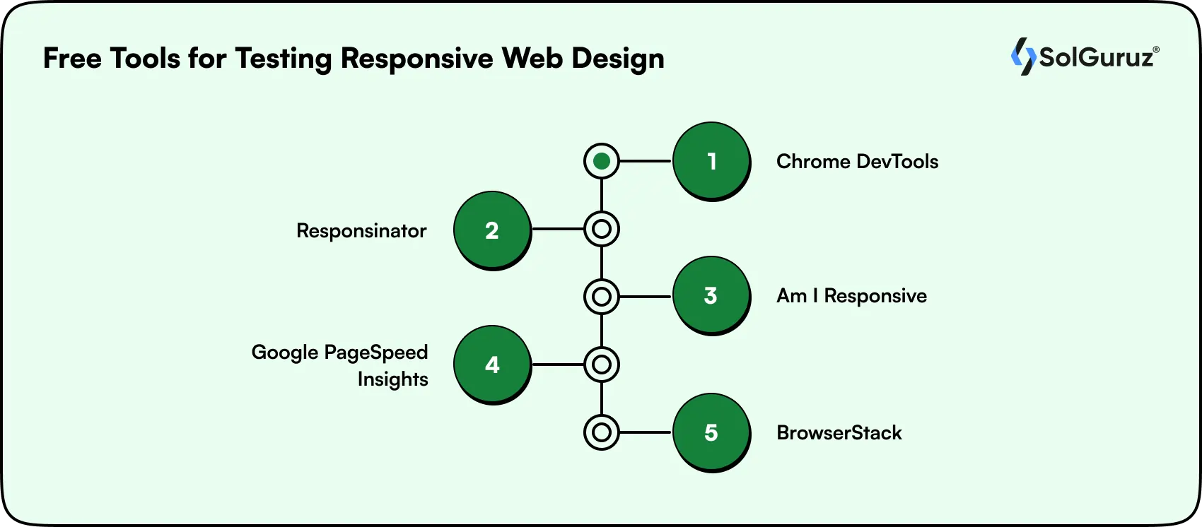
Before you launch (or after you redesign), test your site’s responsiveness using these free tools. Many teams offering Webflow development services and modern web solutions rely on these tools to ensure consistent performance across devices.
1.Chrome DevTools:
Built into every Chrome browser. Toggle the device toolbar (Ctrl+Shift+M) to simulate any screen size. You can also throttle network speed and test touch interactions.
2. Responsinator:
Enter your URL and see how it looks on common devices like iPhones, iPads, and Android phones in both portrait and landscape. It also supports locally hosted projects.
3. Am I Responsive:
A quick visual check that shows your site on four device mockups at once. Great for screenshots and presentations, though not ideal for pixel-perfect testing.
4. Google PageSpeed Insights:
Test your site’s performance on both mobile and desktop. It also flags Core Web Vitals issues like layout shift and slow loading times.
5. BrowserStack:
A cloud-based platform that lets you test on real devices and browsers without owning them. The free tier gives you limited testing sessions.
Common Screen Sizes for Responsive Design in 2026
While content-based breakpoints are the recommended approach, it helps to know the most common screen resolutions you will encounter.
Desktop Screen Sizes
While responsive design avoids device-specific targeting, understanding common desktop screen resolutions helps you make better layout and breakpoint decisions.
| Resolution | Usage Share |
| 1920×1080 | 21.04% |
| 1366×768 | 20.48% |
| 1536×864 | 10.05% |
| 1440×900 | 6.17% |
| 1280×720 | 5.79% |
| 1600×900 | 3.68% |
Tablet Screen Sizes
Tablet users fall between mobile and desktop behavior, so analyzing common tablet screen sizes helps ensure your layouts remain usable and visually balanced across mid-sized devices.
| Resolution | Usage Share |
| 768×1024 | 40.53% |
| 1280×800 | 6.91% |
| 800×1280 | 5.36% |
| 601×962 | 5.21% |
| 810×1080 | 4.47% |
Mobile Screen Sizes
Mobile screens dominate web traffic, so understanding the most common mobile resolutions helps you prioritize performance, readability, and touch-friendly design where it matters most.
| Resolution | Usage Share |
| 360×640 | 9.25% |
| 414×896 | 7.29% |
| 360×800 | 7.13% |
| 360×780 | 5.43% |
| 375×667 | 5.25% |
Remember: these numbers shift every year as new devices launch. That is exactly why designing for content breakpoints rather than specific device dimensions is more sustainable.
Real-World Examples of Responsive Web Design
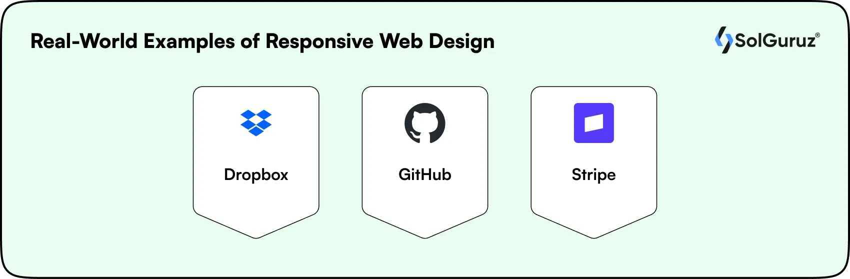
The best way to understand responsive design is to see it in action. Here are a few websites that handle responsiveness well.
1. Dropbox:
Uses fluid grids and flexible visuals across devices. Images reorient, and font colors adjust based on the background. On a desktop, an arrow guides users to scroll for more content. On mobile, the layout simplifies to a single column with clear CTAs.
2. GitHub:
Takes a content-first approach. On mobile, GitHub removes the search bar and collapses the navigation, reducing multi-column layouts to a single column. The call-to-action system changes from a signup form on desktop to a streamlined CTA on mobile.
3. Stripe:
Known for clean, performance-focused design. Their documentation and product pages adapt beautifully across devices, using fluid typography and well-placed breakpoints. Code examples reformat for smaller screens without losing readability.
Wrapping Up
Responsive web design is not a feature you add to your website. It is how modern websites are built. From the layout grid to the images to the typography, every element should adapt to the user’s screen.
In 2026, the expectations are higher than ever. Users want fast, smooth, intuitive experiences on every device. Google rewards sites that deliver this, and businesses that invest in responsive design see real results in traffic, engagement, and conversions.
If your current website is not responsive, or if it was built years ago and has not been updated, now is the time to fix that. Start with a mobile-first approach, use modern CSS techniques like Grid, Flexbox, container queries, and fluid typography, and test on real devices.
At SolGuruz, we build responsive websites and web applications that work on every screen, load fast, and convert visitors into customers. If you are planning a new website or looking to hire web developers to modernize an existing one, our team is ready to help.
FAQs
1. What is responsive web design in simple terms?
Responsive web design is a way of building websites so they automatically adjust their layout, images, and text to fit any screen size. Whether someone visits on a phone, tablet, or desktop, the site looks and works well without needing a separate version for each device.
2. Why is responsive web design important for SEO?
Google uses mobile-first indexing, which means it looks at the mobile version of your site first when deciding where to rank it. A responsive site gives Google one URL to crawl, avoids duplicate content issues, and delivers a better user experience, all of which help with rankings.
3. What is the difference between responsive and adaptive design?
Responsive design uses fluid grids that continuously adjust to any screen width. Adaptive design uses fixed layouts for specific screen sizes (like 320px, 768px, 1024px) and snaps between them. Responsive design is more flexible and is recommended by Google for modern websites.
4. How much does it cost to build a responsive website?
The cost depends on complexity, number of pages, custom features, and the team you work with. A responsive business website typically ranges from $5,000 to $50,000+. At SolGuruz, we scope projects based on your actual requirements and provide transparent pricing upfront.
5. What tools can I use to test if my website is responsive?
You can use free tools like Chrome DevTools (built into Chrome), Responsinator, Am I Responsive, and Google PageSpeed Insights. For more thorough testing, BrowserStack lets you test on real devices in the cloud. Always supplement emulator testing with hands-on checks on real phones and tablets.
6. What are container queries and why do they matter?
Container queries let CSS respond to the width of a specific parent element rather than the whole browser window. This is useful for reusable components like cards or widgets that need to look different depending on where they are placed on the page, regardless of overall screen size.
7. Should I redesign my website to be responsive or build a new one?
It depends on your current codebase. If your site was built recently with modern technologies, a responsive redesign may be enough. If it is an older site with outdated code and architecture, building fresh on a responsive framework is often faster and more cost-effective in the long run.
8. What is mobile-first design?
Mobile-first design means starting the design process with the smallest screen (phones) and then scaling up to larger screens (tablets, desktops). This approach forces you to prioritize the most important content and functionality, leading to a cleaner experience on all devices.

Written by
Lokesh Dudhat
Lokesh Dudhat is the Co-Founder and CTO of SolGuruz, with 15+ years of hands-on experience in full-stack and product engineering. He spent over a decade building native applications across iPhone, iPad, Apple Watch, and Apple TV ecosystems before expanding into backend systems, Angular, Node.js, Python, AI software and solutions, and cloud architecture. As CTO, Lokesh defines and enforces engineering standards, architecture practices, and DevOps maturity across all delivery teams. He is actively involved in system design reviews, scalability planning, code quality frameworks, and platform architecture decisions for complex products. He works closely with product teams and enterprise clients to design resilient, maintainable, and performance-driven systems. His writing focuses on software architecture, headless CMS systems, backend engineering, scalability patterns, and engineering best practices.
From Insight to Action
Insights define intent. Execution defines results. Understand how we deliver with structure, collaborate through partnerships, and how our guidebooks help leaders make better product decisions.
 How we Work
Need a Website That Works on Every Screen?
SolGuruz builds responsive websites and web applications that look great, load fast, and convert visitors into customers. From mobile-first design to full-stack web development, we handle everything.

Strict NDA

Trusted by Startups & Enterprises Worldwide

Flexible Engagement Models

1 Week Risk-Free Trial

